
3 Ways to Capture Interest with Design
How to Capture Interest with Design
There’s a reason the phrase “a picture is worth a thousand words” is such an enduring one. Humans are visual creatures whose brains are wired to interpret images incredibly quickly and studies show images generally sway people more effectively than words.
Visuals help people process, understand, and retain information more rapidly and thoroughly. As we’re constantly competing for users’ attention it is important we learn to harness the power of visuals. How do we make our design pop enough in the 13 milliseconds the human eye takes to determine if visual information is important?
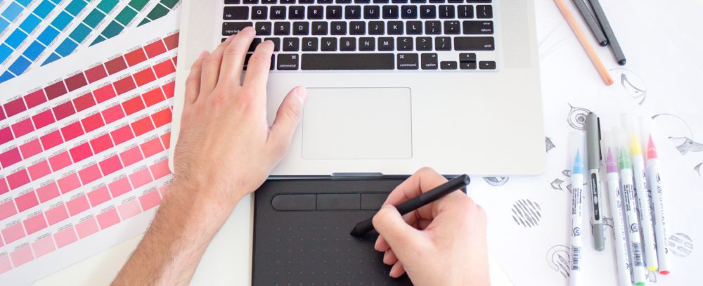
In this post, we’re going to focus on one of the most important tools a designer has to capture visual interest: Contrast.
When we dial up the contrast between color and spatial elements, such as type and patterns, we engage neural systems that say, “this image is important.” Our visual system has developed to detect contrast in the interest of our survival. When our ancestors were scanning the forest for predators or scrubbing the brush for food, the ability to distinguish between shades of green or notice something out of the ordinary spelled survival.
What Is Contrast Within the Context of Design?
In the simplest terms, “contrast” refers to two elements which are different from each other. Contrast draws the viewer’s attention, and when used appropriately will draw the viewer’s eye to what you want to highlight. Let’s look at some of the ways this can be achieved.
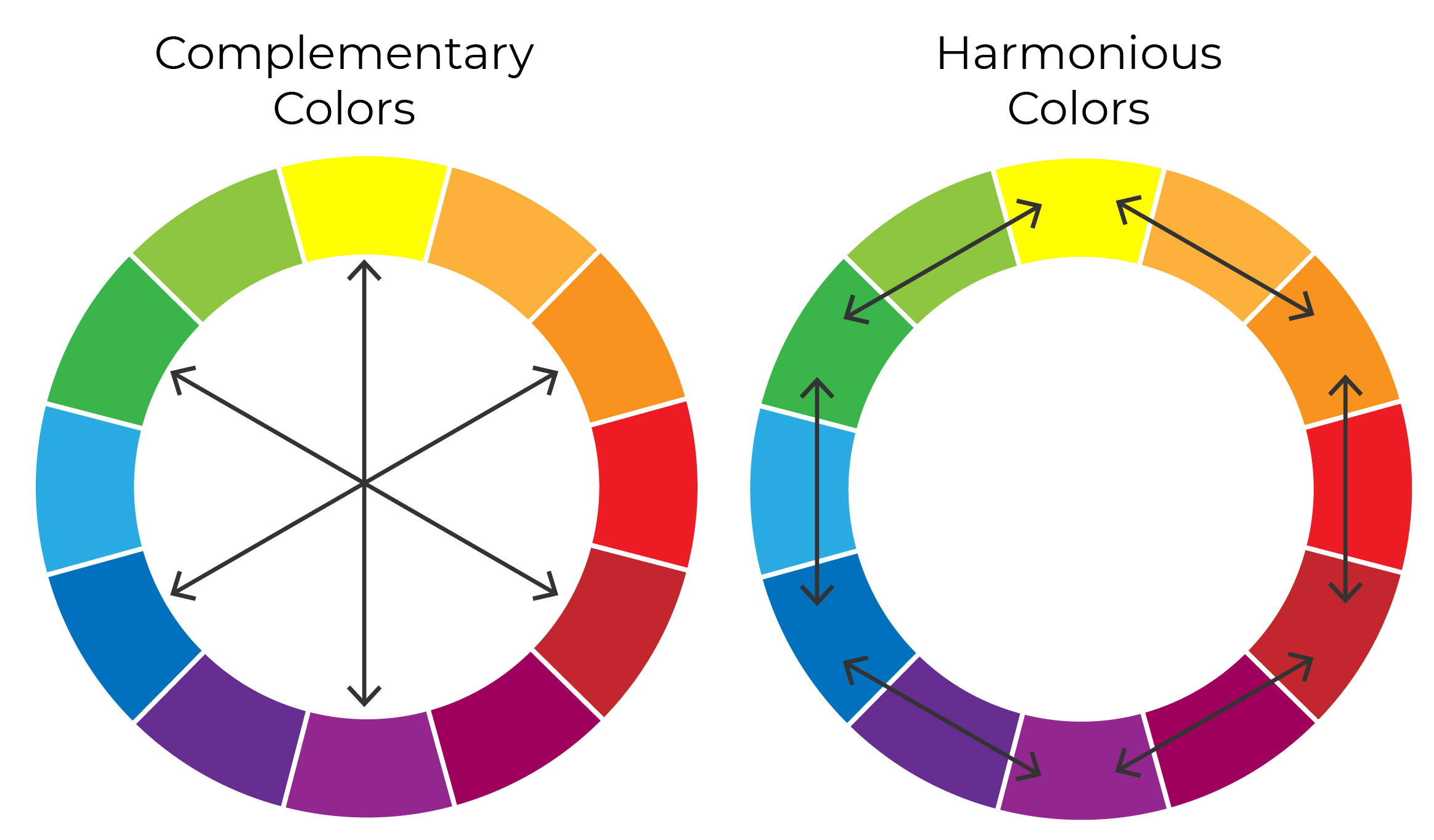
Probably the most common way to incorporate contrast in your designs is using colors. Complementary colors (those across the color wheel from each other) have the most contrast (think yellow and purple) and Harmonious colors (those next to each other) have lower contrast.
Contrast of Size

One of the easiest ways to add contrast to your designs is by making one element bigger or smaller than those around it. Having a contrast of size adds visual interest and can help you establish hierarchy in your layout so you can be sure the focus of your viewer is in the right area.
Contrast of Shape
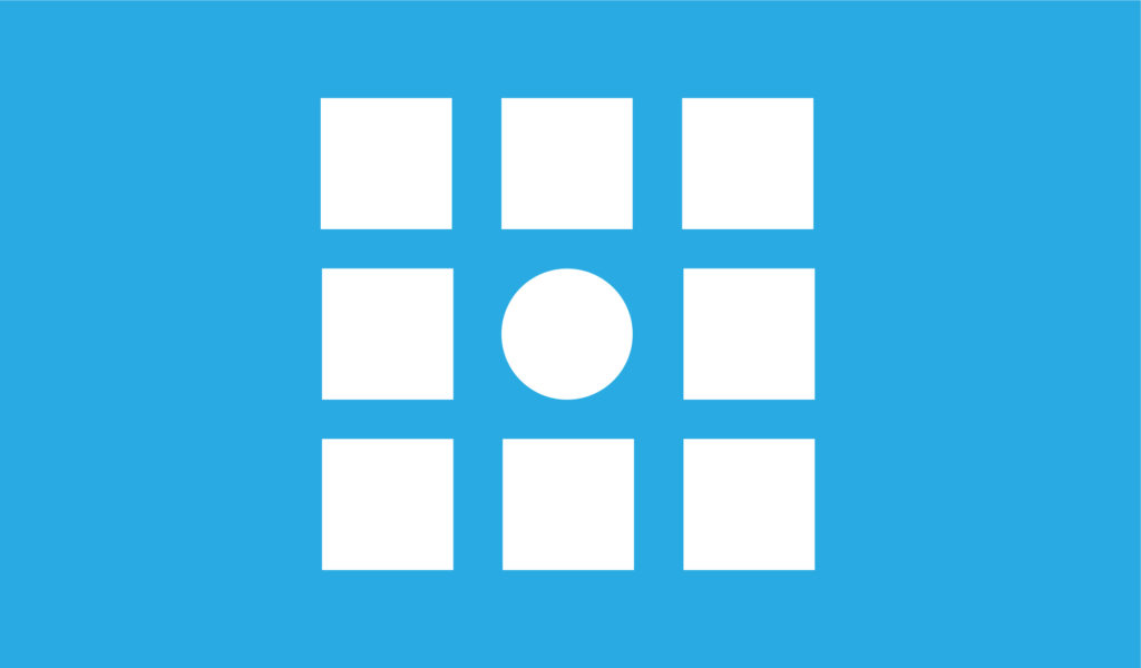
Using a contrasting shape in your design is a great way to automatically draw a viewer’s attention to that specific part of the design, while simultaneously adding visual interest.
Contrast of Typography
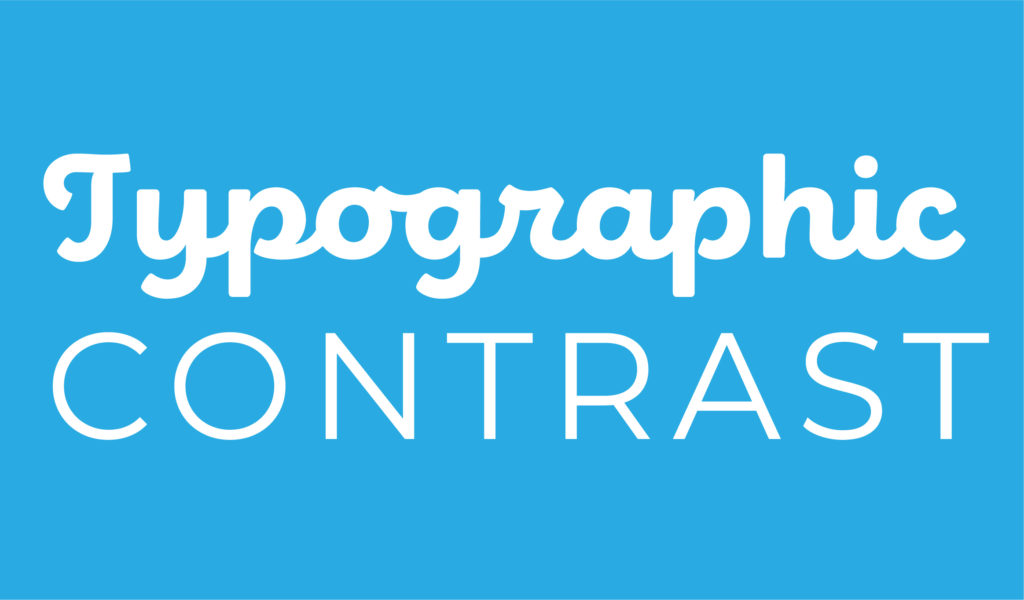
In addition to being able to use size and color to add visual interest in your typography, you can also use different font combinations to add contrast and appeal to your designs.
The next time you are creating a design, remember these evolutionary principles at play and harness these tactics to use the awesome power of contrast to draw in your viewers and effectively communicate your message.
As an integrated marketing and communications agency, WCG has multiple graphic design capabilities to support your brand and organization needs. To learn how we can capture the eye of your target audiences in unique and creative ways, contact us at hello@wilksgrp.com.