5 Best Practices for E-commerce Storefront Design

With Amazon representing nearly 44 percent of U.S. ecommerce sales in 2021, it is clear consumers have grown accustomed to the gratification and convenience of purchasing online. And, with billions in potential sales at stake, brands are investing to build Amazon storefronts that engage visitors, showcase their unique brand attributes and sell. An effective Amazon storefront is also a great way to educate customers about what your brand stands for and its unique voice. Below are five tips to setting up a compelling Amazon Storefront.
1. Showcase Your Brand Identity
- Make sure to lean heavily on your brand guidelines and display your unique design elements and colors. Remember to embed your organization’s purpose and mission.
- Heather and Willow’s storefront does an exceptional job of communicating their brand identity as a source of bridesmaid gifts and essentials. Their brand and purpose are on display everywhere through lifestyle images. The site also includes a CTA to use their gifts to create a bridesmaid proposal box, showcasing what it would look like to use the gifts. This site also includes text throughout to promote their mission.

2. Use Shoppable Subpages
- Create at least 3 pages on your store for better organization and increased sales.
- Subpages are essential for creating a simple user experience. Subpages help customers find what they are looking for while also browsing other items. To ensure purchases it is important to make it easy for consumers to find and add a product to their cart. Subpages allow more room for education about specific products and categories. According to Amazon, stores with 3 or more pages have an 83% higher shopper dwell time and deliver 32% higher attributed sales per visitor.

3. Update Your Storefront Frequently
- Amazon recommends updating your storefront at least every 90 days.
- A storefront that is still decorated with Fourth of July sales items in August shows a lack of care. Consumers want the information on products they are seeking to be kept up to date and relevant. Godiva updates their page theme seasonally while still promoting their hero products. Stores that are frequently updated have 21% more repeat visitors, and have 35% higher attributed sales per visitor, according to Amazon.

4. Build Through a Variety of Image Sizes and Formats
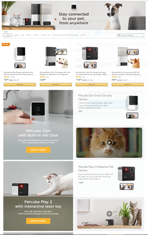
- Petcube’s storefront utilizes a variety of formats including text, images and video to keep it interesting. Displaying diverse content keeps consumers engaged while scrolling. Petcube highlights its hero products first, making them simple to purchase. Companies with clear best-selling products utilize this tactic to ensure quick purchases. As consumers scroll down the page, they also encounter product images with education tips and videos about the products. The product images provide explanations and reinforce the need for purchase. The videos show the products in action.

5. Optimize Your Product Listings
- See our previous post on 5 Ways to Optimize your Amazon listings.
Email us at hello@wilksgrp.com for more information on how our digital team can strategically support your e-commerce needs.