3 Secrets to a Great Website

A website is your organization’s calling card and an essential tool for breaking through the online clutter to make a strong first impression. A well-designed site can build your brand, attract new followers and drive sales; however, launching one can be a long, laborious and sometimes expensive process and it is critical to begin the process by defining a clear vision.
So, how do you determine when it is time to consider a new or updated website? Below are three tips for success.
1. It’s Time for a Rebrand and Refresh.
While this may seem obvious, it is important that your website conveys a contemporary story about your organization. As organizations change and evolve over time, and your current site should reflect that. If competitors’ sites appear more modern and are easier to navigate, they are more likely to rank higher on search engines and better capture the interest of your target audience.

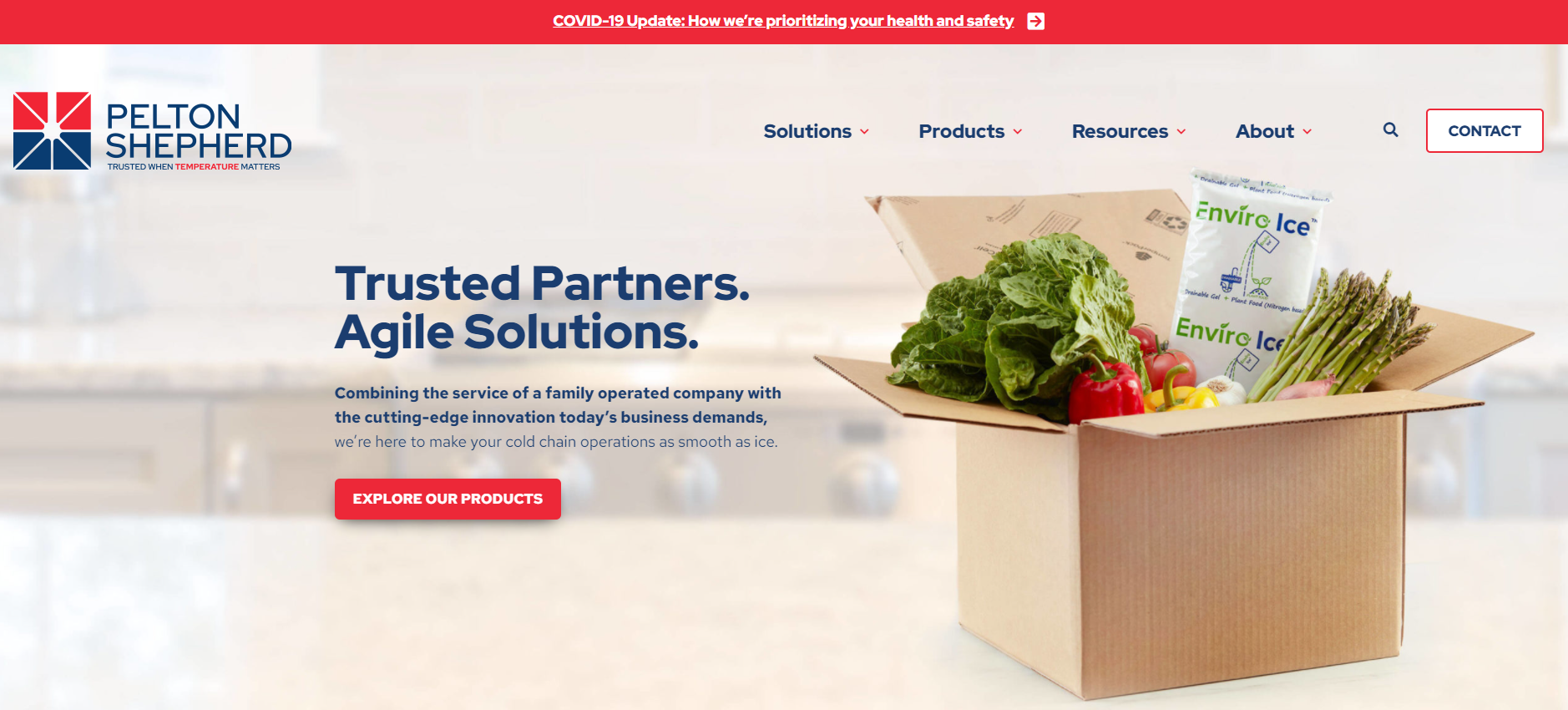
The WCG team recently redesigned a website for Pelton Shepherd during a rebrand to ensure a contemporary and consistent brand presence and tell the company’s evolving story, with a curated SEO strategy to drive awareness and clicks.

To upgrade the look, feel, and flow of the website, we first explored the company’s business priorities, brand identity and unique value proposition to envision its ideal website. From there, we created site structure to fit the brand and vision, as well as support the key business objectives. The newly relaunched site is below.


Most new websites include a redesign, updated structure, refreshed imagery and new content. In some cases, ecommerce is a key component added to a site to drive online purchases.
2. Users Are Struggling.
A poor user experience can be a make-or-break moment for any website. It is important to frequently audit your existing website’s capabilities and effectiveness. Analyze key performance metrics to identify issues such as high bounce rates, low average time on pages, or low conversion.
These are all clear indicators that it is time to update your content, structure, or landing pages. If ecommerce is part of your site, focus on functionality and a clear user flow that prioritizes conversions.
3. Your Site is Slow and Stagnant.
Given how much time we spend on mobile devices, it is critical to ensure that your website is easy to navigate across all interfaces. Consider using a platform that will allow for easy content updates and optimizations.
For example, The Art Institute of Chicago understood the need for mobile responsiveness. Their updated website expanded its scope “to encompass the interconnected nature of the web,” optimizing content display for mobile. As an organization that depends on the visual element, their team understand the value of visually optimizing the user experience – and they even added thousands of hi-res images online for free viewing.
Be on the lookout for any of these signs that your website might be due for a refresh. An up-to-date website will allow you to communicate your brand identity, improve user experience, and continue to grow your business.
Are you looking for a unique, creative website that will engage new audiences for your organization? Email us at hello@wilksgrp.com to learn more about our digital expertise.